What was tested
Ewa Home is a physical plug that can be used to monitor e.g. the electricity consumption of an electronic device, or the temperature in a room. I was asked to test the UX of both the boxing, the plug itself, the installation of the plug, and the app that came with the plug.
- 1 week
- Women aged 20-40 with an interest in interior design
- All newer smartphones
The test missions
What is the first impressions of the box, the plug and the app?
Is the installation process intuitive and the instructions easy to follow?
How is the product’s usability?
The results
The test showed that the target group wanted a simpler app, with a more intuitive installation process. I gave a number of suggestions to what could be improved. After the run, I was hired to help the company with designing the wireframes for a final version of the app.
How can you do it too?
1 on 1 interviews
Present the test participants with the system and ask them to perform a number of tasks while talking out loud about their experiences.
Device test
Instal the app on several, common mobile devices, and go through the most common use-scenarios while looking for issues.
Usability review
Go through the company’s website, the product’s boxing, and the app, analyzing its visual and logical design, starting from the concepts of learnability, efficiency, memorability, error recovering, and satisfaction.
User experience mapping
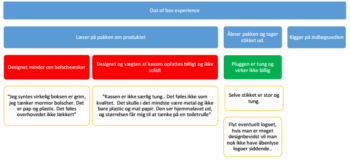
Note down the test participant’s satisfaction and comments as they use the product. Then create a map of their experiences using visual cues and signals. The method makes it easy to report on your findings, in a visual (and quick) way.
Read more
- This excellent article guided me through user experience mapping: https://medium.com/@wnialloconnor/how-to-build-an-experience-map-5e55b7ee4f32


